( Locked ● Limited version )
by CJ Craig
On this page:
- Access to these notes
- Overview
- Responsive design
- PageSpeed metrics
- Accessibility
- Masthead themes
- Product page
- Photos page
- Checkout page
- Search function
- Promo codes
- Promo, Live Demo
- Server configurations
- Colophon
There’s a Notebook-link at the very bottom of every page.
💡 Open the Store Homepage in a new tab,
so that you can refer to this reference side-by-side.
[ ✗ ] Clear any user-added #Anchor from address-bar,
or add one using # in any section-heading below.
# 1. Access to these notes
This reference is intended for a select audience; it covers some of the design decisions and technical aspects of this online store. There are two versions, the Full version and the Limited version (which has sections 5 through 13 excluded).
If you previously accessed the Full version of this notebook from another device, or if you have cleared your browser’s cookies, you will need to again begin from the URL that you previously used to unlock this reference.
# 2. Overview
Built from scratch, the Think Great Stuff store is entirely my endeavor: Graphic design, UI/UX, PHP, javascript, html5, css. Because of its unique design I’ve decided to share here something of the considerations that went into its build, all of it hand-coded.
Since buyers in the Vintage & Antiques marketplace tend to be an older demographic, their UX preferences and expectations inform many of the design choices.
- Comfortably stable layout and efficient navigation. Also no popups, interstitials or animated-dance of product photos. You might think of it as “a vintage site” (selling vintage stuff) with just the right amount of modern UX accoutrements.
- Custom-built Shipping Calculator that is accurate to exactly what UPS charges the store’s account, with Small Business discounts applied. Server-side code includes the entire UPS Ground table, Area Surcharge Zip codes, dimensional weight calculator, insurance cost calculator, and all other UPS ‘value added services’.
- Comprehensive, flexible and tamperproof system of promo codes, including single-item discount codes, more below on this.
-
… and a companion toolset (not shown), which includes an efficient Products Listing Tool, a built-in option to generate listings compliant to other platforms (such as eBay), printed label generation for inventory control, and feeds generation,
Sitemap (for bots)
Products Sitemap
Google Merchant Feed.
# 3. Responsive design
Responsive design — but not in any of the usual ‘layout shift’ implementations. For a variety of reasons, a different approach, providing a consistent page layout across all devices.

- Three breakpoints, Left to Right:
- Desktop browsers and extra-large tablets (13" iPad Pro shown)
- 11-inch and smaller tablets (8.3" iPad Mini shown)
- Phones (6.7" iPhone 13 Pro Max shown)
Through careful consideration of viewport real estate and perceived-size of elements based on those in close proximity, a solution that renders the same page layout desktop and mobile, the responsive aspect being solely the font size.
# 4. PageSpeed metrics
Tuned for fast serving and rendering, earning high marks from PageSpeed. Here is a recent screenshot showing the Pagespeed metrics for a typical product page, Item # 21001105.

By the way, at the bottom of every store-page is a link that directly submits itself to PageSpeed. Note, though, that (dependent on the variability of site traffic over the previous 28 days) some or all of the Field-metrics may at times show as N/A, and the Lab-metrics may vary significantly based upon transient server and transport factors.
# 5. Accessibility
This section is only
available to those with
Full-version access.
# 6. Masthead themes
This section is only
available to those with
Full-version access.
# 7. Product page
This section is only
available to those with
Full-version access.
# 8. Photos page
This section is only
available to those with
Full-version access.
# 9. Checkout page
This section is only
available to those with
Full-version access.
# 10. Search function
This section is only
available to those with
Full-version access.
# 11. Promo codes
This section is only
available to those with
Full-version access.
# 12. Promo, Live Demo
This section is only
available to those with
Full-version access.
# 13. Server configurations
This section is only
available to those with
Full-version access.
# 14. Colophon
-
Made on a
 Mac
Mac
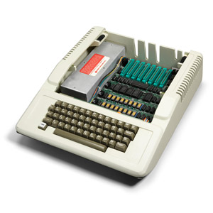
And not my first Mac.
A lot has changed since then.< wayback >
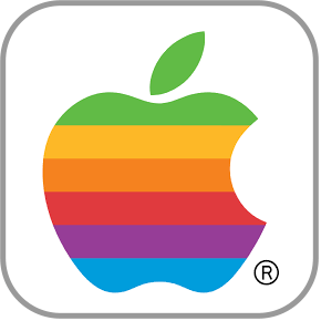
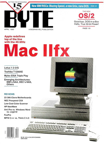
My first Mac was a IIfx that I bought used in 1992, already nicely fitted-out with a whopping 32M of ram — in its day a great box for doing Photoshop work. Even more wayback, in 1982, I designed and built an EPROM programmer that slotted into the Apple II backplane; hardware a wire-wrapped breadboard loaded with chips; software entirely 6502 Assembly Language.
< /wayback > -
The Think Great Stuff store and its companion toolset were built using just three apps:
 Photoshop,
  BBedit, and
  Transmit.
-
Hosted on
 Amazon Web Services.
- Advertising: Google Ads & Facebook Ads platforms, and printed materials.